Background repeat space and round
This is the first entry in (probably) a long list in my series of front-end tips and tricks with the tag how did't i know this?!?
I've been writing front-end code for about 25+ years, and still I find solutions on the web that make me wonder: "this is brand new to me, really?". That's also the great thing about this field of work: there is so much to learn. I still love it after all there years.
The problem
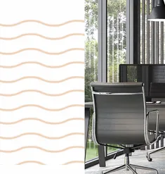
So, let's get to the problem. I was building a website where the designer had a nice wavey background pattern behind a box, with an image inside. The height of the box is flexible, because the image scales on different screen sizes, and we don't want the pattern to be cut off awkwardly, do we?
So with a basic piece of css you'd do something like:
background-image: url(./img/pattern-wave-pink.svg);
background-repeat: repeat;
background-position: 0 0;
But... this, is the result, a cropped pattern. And we don't want this...

The solution
Searching for a solution, I came across the round and space values of the background-repeat property. Good old CSS tricks has a great, concise resource on this.
The space value uses "whitespace" to fill the background so the image tiles, but never crops.
The round value will scale (resize, stretch, whatever) the image so it tiles, but also never crops.
So if we use this:
background-image: url(./img/pattern-wave-pink.svg);
background-repeat: repeat round;
background-position: 0 0;
The background is repeated along the x-axis, but rounded along the y-axis. And then we get this:

Ahhh, that's better :)
The following Codepen gives an even better insight on how this works:
See the Pen The Different `background-repeat`s by Chris Coyier (@chriscoyier) on CodePen.
Isn't CSS amazing? And again: how didn't I know these values exist?